
UK Electricity Supply
75 years of UK electricity generation and supply
Overview
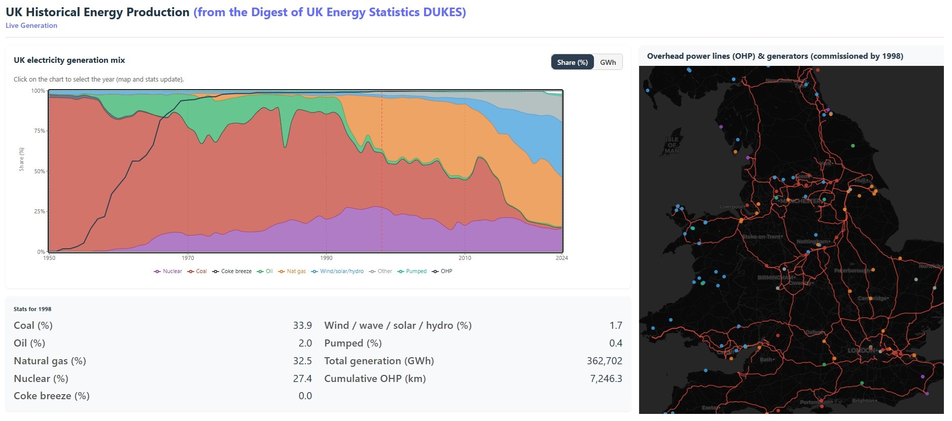
This interactive dashboard explores the dramatic transformation of UK electricity generation from the post-war era to the present day. Using data from the government’s Digest of UK Energy Statistics (DUKES), it charts how the fuel mix has shifted year by year from 1950 to 2024 — from an era of almost total dependence on coal, through the rise of nuclear and natural gas, to today’s increasingly renewable-powered grid.
Alongside the generation chart, an interactive map traces the physical infrastructure underpinning the network: overhead power lines commissioned over the decades and the individual generating stations — coal-fired, nuclear, gas, wind, solar, and hydro — that were active in any given year. Use the year slider to move through time and watch both the energy mix and the map update simultaneously.
The BMU Map: Near Real-Time Wind Generator Monitoring
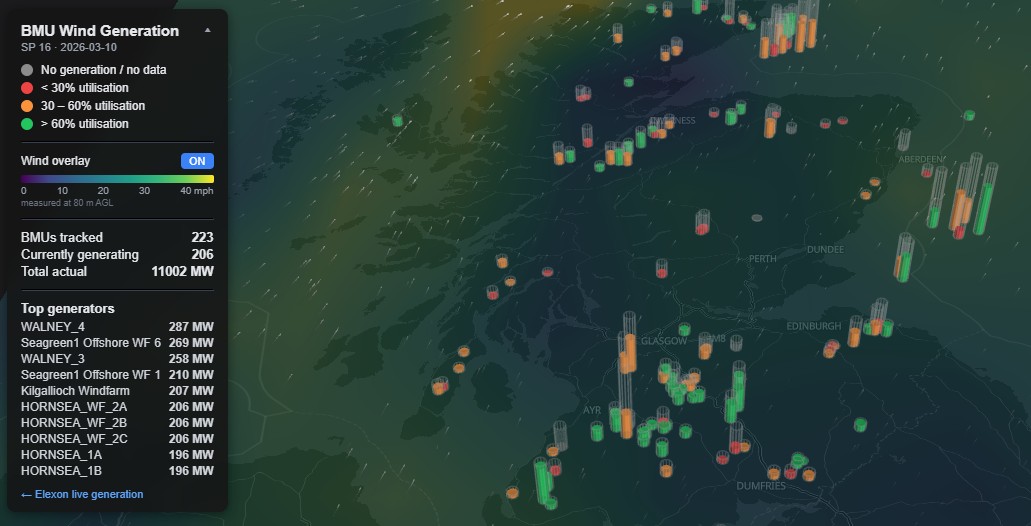
this is a 3D app - hold down the right mouse button for 3D navigation
This interactive map application presents the locations and generation status of wind generator units and wind farms that are incorporated into the UK electricity system operator’s (National Grid ESO) Balancing Mechanism. Each Balancing Mechanism Unit (BMU) in this system can be independently controlled and monitored within the national grid to help ensure system stability, balance, and efficient operation.
Elexon is the organisation responsible for operating and managing electricity market settlement systems in Great Britain, and it publishes a range of historical and near real-time generation data through its API service. The app uses the Elexon BMRS API, specifically the PN stream endpoint: https://bmrs.elexon.co.uk/api-documentation/endpoint/datasets/PN/stream.
This API provides data for individual Settlement Periods (SPs), during which electricity generation and consumption are measured and settled. In the SP system, wind farm operators (or their appointed trading parties) submit bids and offers to the electricity market, including forecasts of how much power they can generate.
The app presents the geographic distribution of wind BMUs across the UK and provides a 3D visual representation of near real-time generation for each BMU relative to its stated capacity.
The app also provides a real-time overlay of current wind conditions from Open-Meteo, at 80 metres above ground level (more representative of turbine hub height), to illustrate the relationship between wind speed and generating output.
The BMU Map is built with React, Vite, and MapLibre GL for interactive mapping. It connects to a custom FastAPI backend to fetch, process, and georeference BMU data from Elexon. The app uses modern web mapping and data visualisation libraries to deliver a responsive user experience.
Generation mix
The stacked area chart shows generation by fuel type — coal, gas, nuclear, oil, wind, solar, and hydro — in either gigawatt-hours (GWh) or percentage share. Toggle between the two to compare the absolute scale of growth alongside the changing proportions.
Infrastructure
The map layers show the cumulative build-out of overhead transmission lines alongside individual generating stations, filtered to those commissioned and still operating in the selected year. See how the grid physically expanded to connect new generation capacity decade by decade.
The road to net zero
With coal all but gone and renewables now the largest single contributor to UK generation, the trajectory is clear. The dataset runs to 2024 — a snapshot of a grid mid-transition, still supported by gas but increasingly shaped by wind and solar capacity added at pace since 2010.